The road to nirvana |
|
My journey into Photography, Horology, and Audiophilia |
Lost in Emotion
My take on the Emotion UI 3 (EMUI 3)
February 20, 2015
Launcher
The purpose of the launcher is to organize your apps and launch them. It could be as simple as Nokia's Z launcher, or as complicated as HTC Sense.
If you are a fan of 3rd party launchers, stay away as there is no way to change the EMUI 3 launchers. Yes, plural.
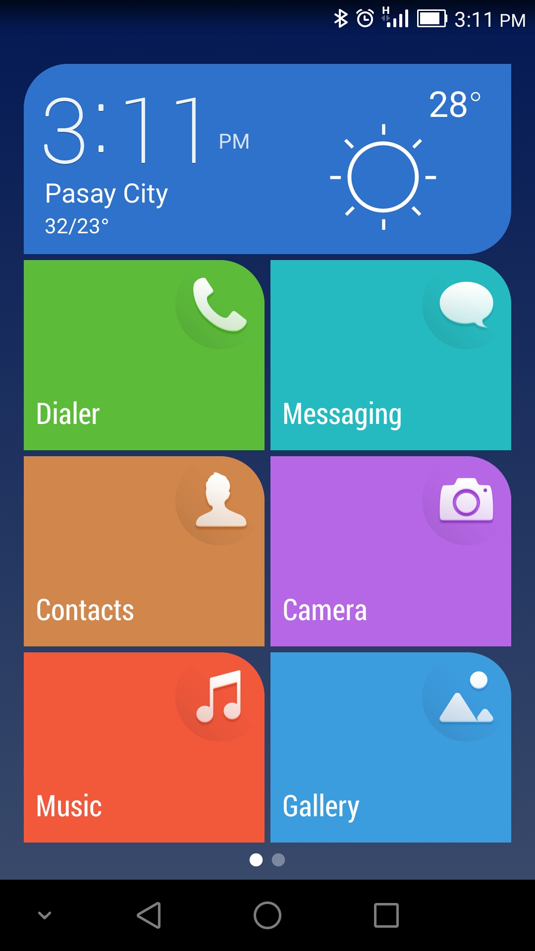
Most people also refer to the launcher as the "home screen" and there are two options, one of which I'd like to get out of the way now.
This is the Simple home screen. It doesn't excite me but I'm not totally disregarding it's potential use.

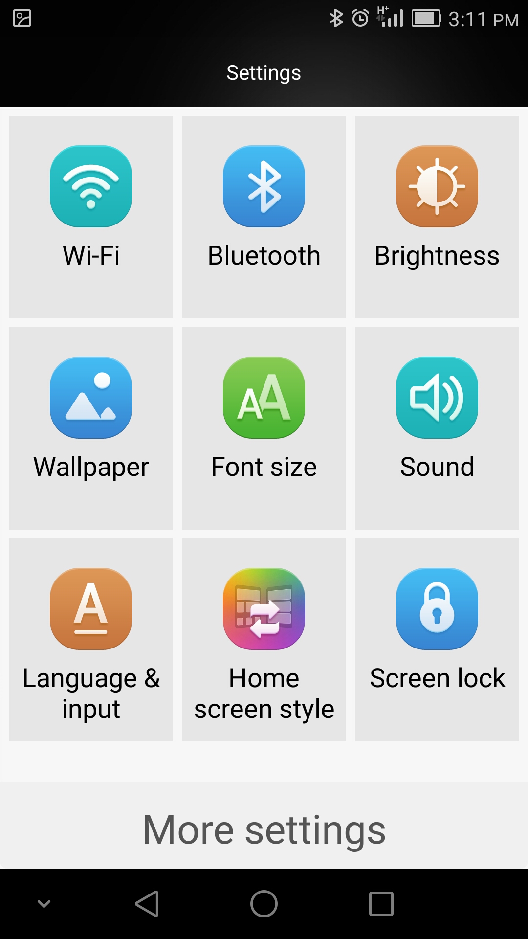
The Settings is also simplified. The font size used in this mode is pretty big, you won't miss reading a text.

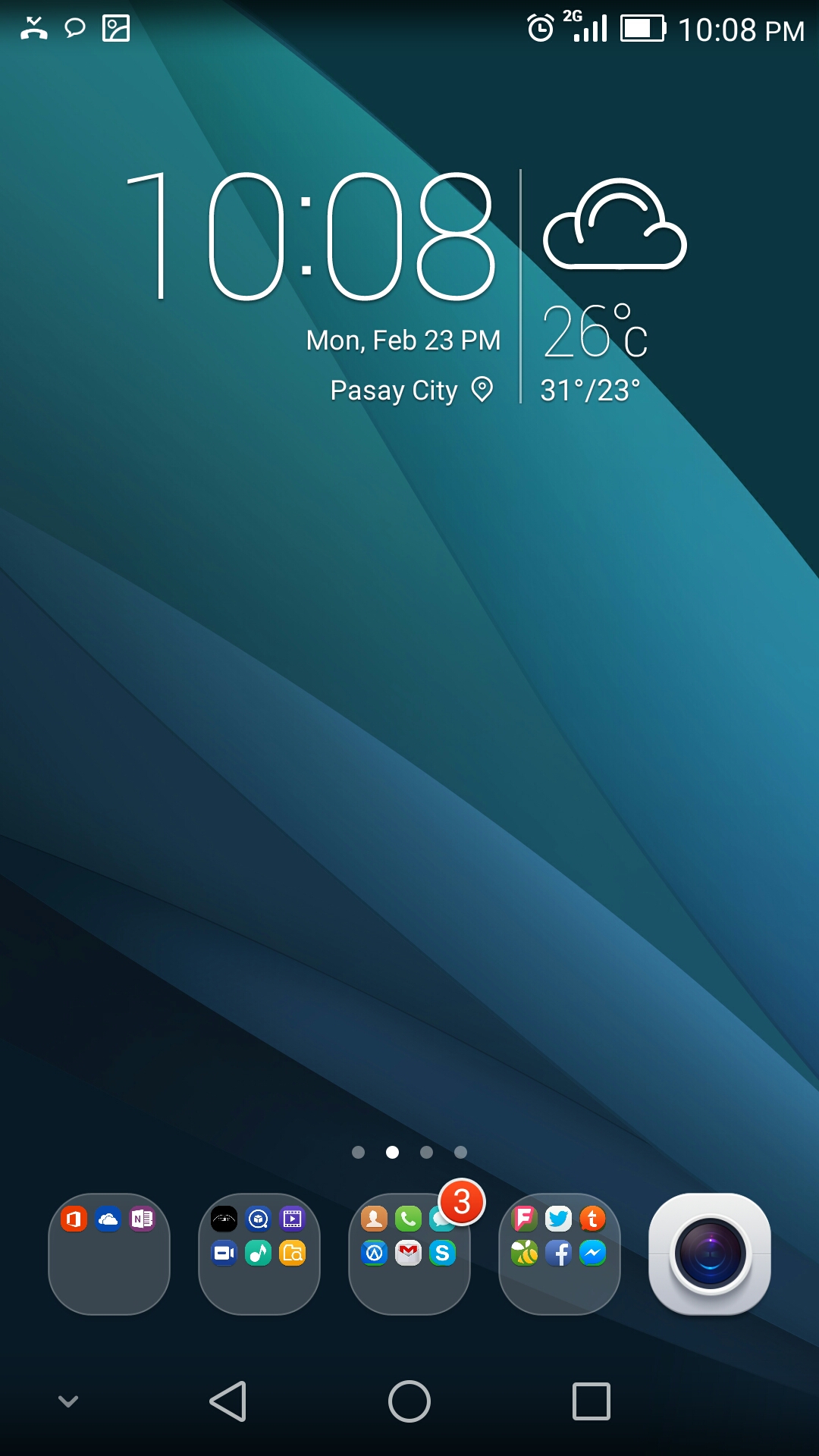
With that out of the way, let me talk about the Standard home screen which is the subject of this blog.

As you can see, it isn't really a big change from the usual Android launchers. It still has a wallpaper, that offers static and "live" options, dock area, widget area, and of course selectable grid for laying out the app icons.
Pull down the home screen and you will be able to search and see a list of recently used apps.
Pinch (or touch and hold) the home screen and you can see the customizations available that ranges from wallpapers, widgets, transitions, and layouts. Transition effects include Loop, Default, Perspective, Windmill, Squeeze, Box, Flip over, Rotate, and Page. The available layouts for the Honor 6 include 4x4 and 4x5.
I organized my apps into folders and I found it a bit disappointing that there are no notification counters unless they're coming from the EMUI apps like Dialer and Messaging. Apps and folders can be placed in the dock area.
Google Now
I use Google Now a lot, just as I use Cortana on Windows Phone. So being able to access Google Now via a single upward swipe from the bottom of the screen is pretty convenient.
| < Prev: Magazine Unlock | Next: Apps > |